If this is your first visit, be sure to
check out the FAQ by clicking the
link above. You may have to register
before you can post: click the register link above to proceed. To start viewing messages,
select the forum that you want to visit from the selection below.
Vagrant Story had such a fantastic art style, and its really captured well in the covert art. I remember musing over purchasing this game versus Legend of the Dragoon back when they both came out. Guess which one I chose?
FFXII Collector's Edition
Easily the best looking collector's edition I've come across.
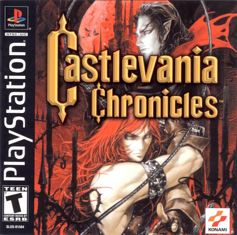
Castlevania: The Dracula X Chronicles
The interior of the case shows a portrait of Maria seeming as PSP cases are transparent meaning that the insert is double-sided. I wish all PS3/PSP games took advantage of their clear cases and made their inserts double-sided.
You should have lumped this into one topic and called it "why do western games have such terrible box art???"
Seriously, look at the Japanese Siren
jap ico
jap soul nomad
And compare them to their American counterparts. Why is it that localization teams believe the only thing that sells are boring frontal face shots with red. Lots and lots of red.
There's only one American cover off the top of my head that I liked more than the Japanese version and that's No More Heroes. I wish more companies like Agetec would leave the box art unchanged because American box art has to be cluttered by a 72 point font of the title and a blurry image of the hero's face.
every akira toriyama cover is pretty much the best
say what you will about akira toriyama and "lol his style is the same" that guy knew a thing or two about cover design.
look at the energy in this picture. the framing is perfect, the title isn't obtrusive, marle's line of fire (which isn't accurate but still awesome) draws your eye from the title to chrono then down to marle and then frog laying in the snow. if you were 8 years old you probably begged your parents to buy this **** based on the cover alone.
another good japanese cover which the american version ruins by their obsession with zooming in on things
such a great cover
such a mediocre game
finally, steve purcell is the god of box art IMO.
i mean, look at this
this is the greatest thing ever.
how is it that purcell can cram so much stuff in a single cover without it looking crammed and messy?
i'm spending 60$ on your crappy game printed on a 25 cent disc inside of a 10 cent case with a 1 cent wraparound cover and a 10 cent manual. The least you can do is provide me with appealing boxart that will make me proud of displaying it on my shelf; not so embarrassed that i want to stuff it in a sock drawer (which is where i keep my truly bad games)
The interior of the case shows a portrait of Maria seeming as PSP cases are transparent meaning that the insert is double-sided. I wish all PS3/PSP games took advantage of their clear cases and made their inserts double-sided.
I prefer this one. Its not as if I have a hard-on for the color red, but it just works.
The box art designers later admitted that they had deliberately chosen this theme in order to attract the customer with something original considering there were many space shooters in the market that looked alike.
so, here's JP Castlevania: SotN.
I have great issue with the direction Castlevania has taken in the years since this game, especially in art design yadda yadda. BUT THIS COVER, in which a COOL VAMPIRE, cross in his EPIC GRIP, RIGHTEOUS SWORD in his other hand... the juxtaposition of elegance and strength. this new style was part of what made SotN so awesome.
now it's just mangirls.
this is the US version of Castlevania 4:
while it's not original, it's filled with implied action and danger. to me it's just better than the japanese original by miles.
I think this is Dracula X, a subpar "remake" of Rondo of Blood. boxart is pretty cool though.
two quick examples of more implied action, as well as relevant characters and altogether interest value.
but oh man, this cover is just so cool.
he's a wizard, right? he's got his robe and wizard hat. but then he's totally ****ing ripped. it's like, he doesn't even NEED magic to beat the **** out of you. holy **** **** goddamn.
but here is my favorite boxart, including back cover.


Comment